Culture by Color: Series by Joan Fabian

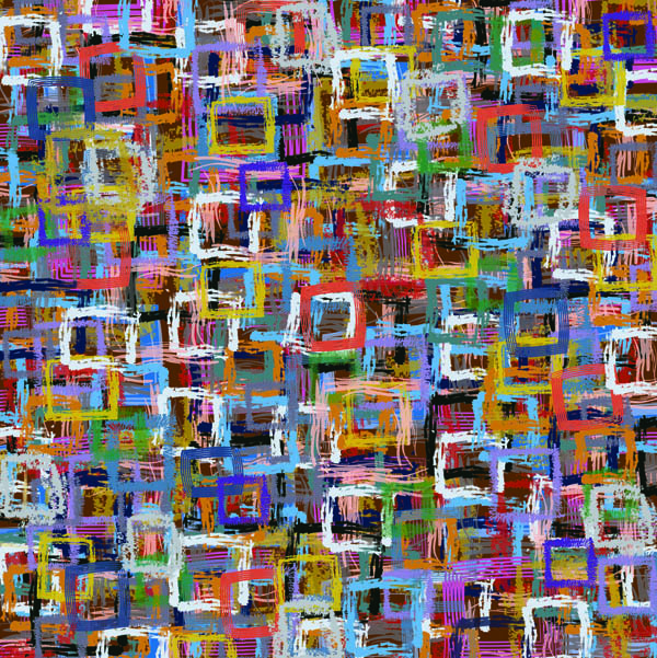
Dutch Combo, 2012, digital painting

Woven, 2012, digital painting

Delft Rain, 2012, digital painting

Flat #589, 2012, digital painting

Amega Mark, 2012, digital painting

Garbage Can Beat, 2012, digital painting

Snake Dance, (2011), acrylic/latex on vinyl, 48 x 56

Somewhere in There, 2011, acrylic/latex on vinyl, 48 x 56

Hot Sun Spell, 2011, acrylic/latex on paper, 11 x 17 in.
Artist Bio
Joan Fabian was born in Chicago and currently lives and works in San Antonio, Texas. She attended the School of the Art Institute of Chicago for her BFA and received her MFA at the University of Texas at San Antonio. A Fulbright Scholar to Pakistan, where she taught painting and graduate studies at the National College of Arts in Lahore. She has had exhibitions at the McNay Art Museum, San Antonio, Parsons School of Design in Paris, France, ARC Gallery in Chicago, Broadway Gallery, New York City and the Smithsonian International, Washington D.C. Fabian has completed two Dutch art residencies in Rotterdam and Delft where she lived in transitional and challenging neighborhoods not usually experienced by tourists, transforming her art into a community experience. Fabian received a Pollock Krasner Grant, Puffin Foundation Award, Austin Fairchild Grant, and was an Official State of Texas Artist Finalist in 2011. Art of Possibilities is licensing her designs to in marketing products and printed into fabric. In her paintings she uses color as a form of sound – projecting memories and experiences associated with the ones she chooses.
Artist Statement
I am an artist with a hearing impairment and I have heightened color sensibility that I use to understand the world around me. Having been hearing impaired since a young child, color fills in for what I fail to hear – it is a language unto itself and holds meaning that I understand and utilize in my painting. The effects of my disability have become a unique and personal element in my creative process. Usually I paint in acrylic and latex, the traditional old fashion way of a painter.
Trying something new this time, I am creating a series of digital paintings that utilize my experience as an outsider while attending an artist residency in Delft, the Netherlands (2009) called Culture by Color. During my stay there, I worked and lived in an old building slated to be demolished. My neighbors in this low – income residence were primarily recent immigrants to the Netherlands with diverse backgrounds, cultures, and consequently personal color palettes. I found myself within several layers of cultural difference, as an artist traveling with a hearing impairment, an American in the Netherlands, and furthermore in this specific immigrant neighborhood. As such, Culture by Color is my attempt to examine the phenomenon of color as a mapping devise for understanding a culture.
To truly know a culture one usually learns the language. Being an artist with a hearing impairment, I assign meaning to colors and they are often intense because the sounds around me are soft. Using hearing aids allow me to hear sound. I wonder how “correct” this digitally amplified sound is. The same process happens when we use computers to produce color representatives. To engage the same process, I will employ color as defined by Pantone, the world-renowned authority on color and provider of color systems and leading technology for the selection and accurate communication of color.
By capturing the color schemes in Pantone I am interested in the technical attempt to capture the reality of color. By creating a map painting of the colors I challenge the different perceptions of a place by showing how we perceive color, whether it is the “correct” color we saw or the replacement by digital means. Which one is valid in accessing the experience of a culture or is it even possible?
In Delft, a city known for its blue and white Delftware and Vermeer, the color blue is often found in many places. This shade of “Delft blue” has a Pantone equivalent to my memory of it. In my particular residency, however, since I experienced a multicultural array of colors from the people also living in these apartments (Turkish, Surinamese, Indonesian, and other), my memories of the Netherlands are perhaps more colored than most. This is a part of Delft that tourists do not know and don’t often think of.
Taking the digital photograph into Adobe Illustrator I select the color option tool to obtain the Pantone color equivalent. Using the assorted brushes/tools available in this software to apply each layer of color on a digital canvas that consist of abstract forms using the Pantone colors selected. The paintings take on a density of visual complexity.


Thanks EIL for being so supportive of my art and project. I really love your magazine and it has great energy throughout!!! Bravo!